Google Chrome: A masterclass in how to build a product for yourself.
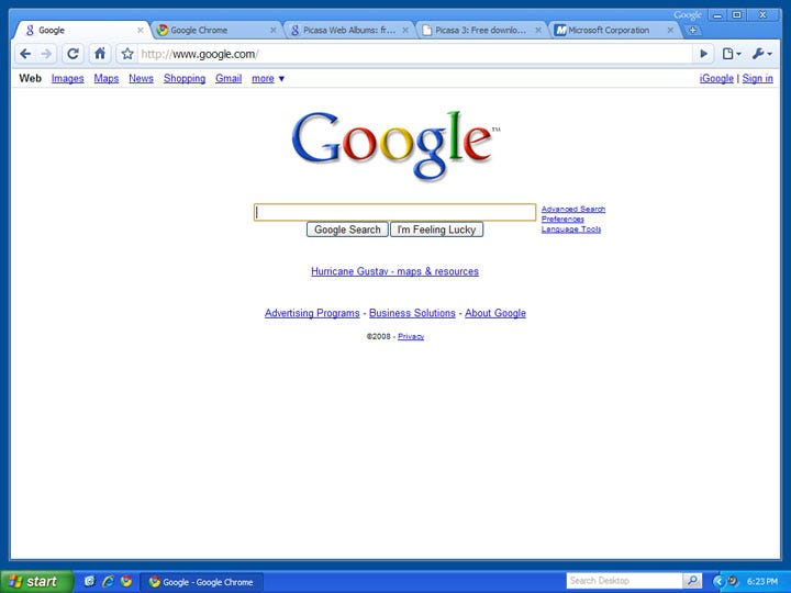
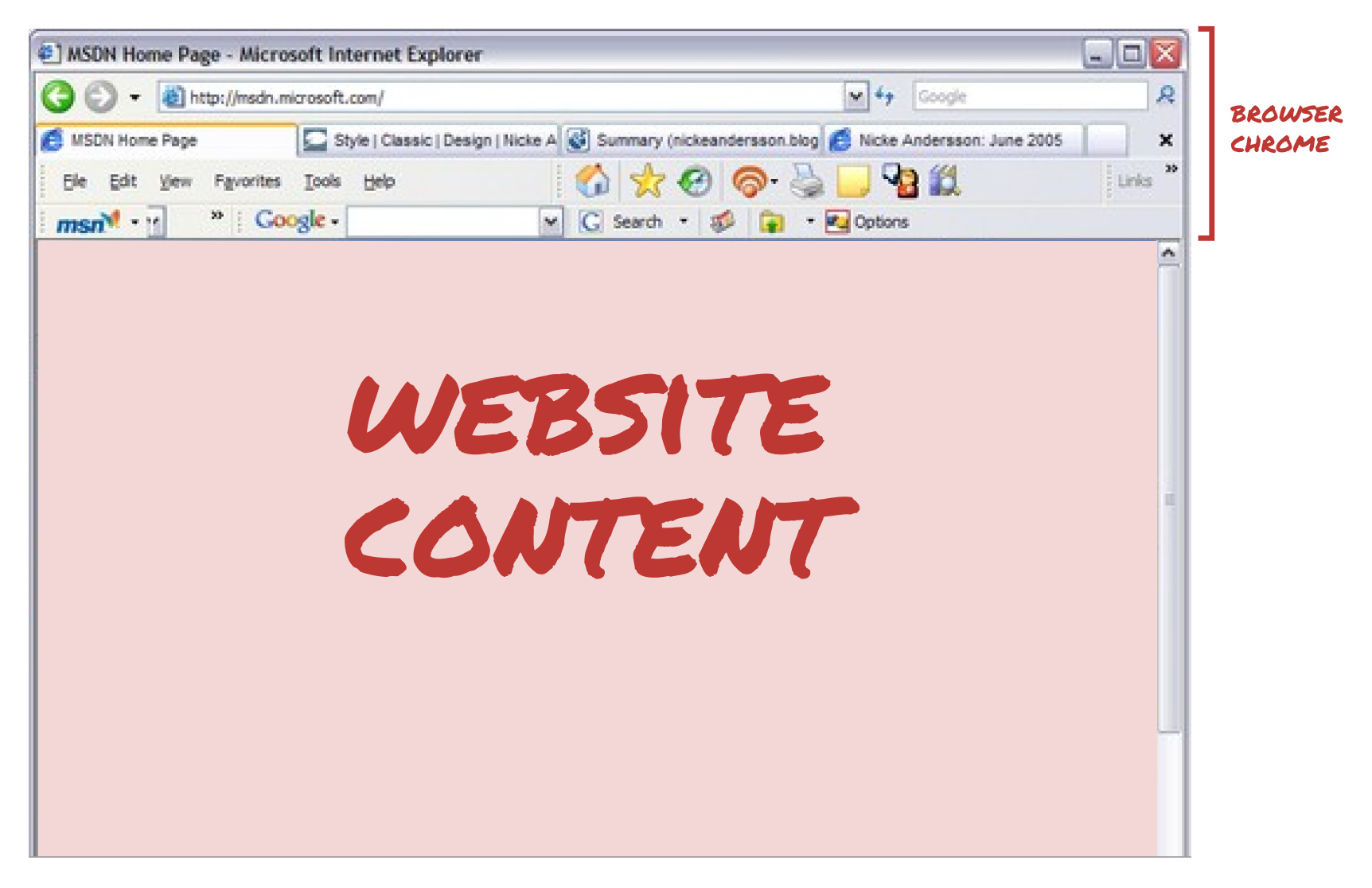
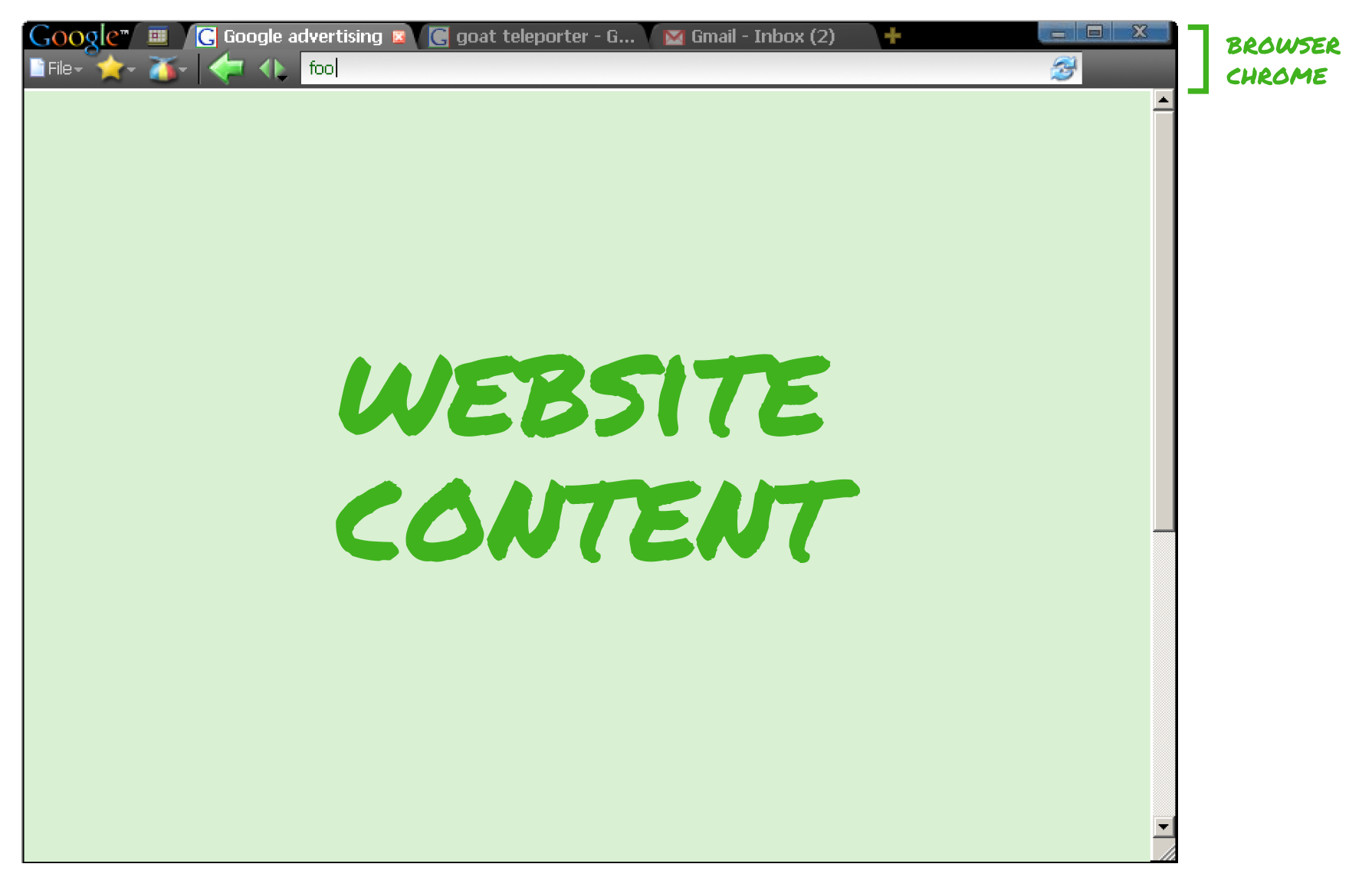
Google Chrome: A masterclass in how to build a product for yourself.How the Chrome team built a browser for themselves and why it worked so well.In the mid-2000s, several Googlers were frustrated with the limitations of existing browsers. So they set out to build a better browser. They discarded existing conventions and aligned on what they wanted in a browser. They wanted to create a simple, fast, stable browser — for themselves. The state of browsersIt’s important to revisit what browsers were like in the mid-2000s. The big browsers (Microsoft’s Internet Explorer, Mozilla’s Firefox, Opera, etc.) were in a race to add more features. With each new feature, came a new button, more browser chrome, and less space for website content. Browsers weren’t just becoming more cluttered and complex, they were also getting slower and crashing more frequently. Browsers had been built to handle simple web pages. As web applications like Gmail and Google Maps emerged, they pushed up against the capabilities of what was possible to do inside of a browser. Designing for themselvesMozilla’s Firefox browser was an open source project and several Google engineers were directly contributing to it. They intimately understood the limitations of the existing browsers and realized that to solve these, they would need to build a fundamentally different type of browser. So they stepped away from supporting Firefox and got to work. The team took time to consider what they wanted in a browser. They wanted a browser that was fast. They wanted a browser that got out of the way and put the focus on the web content. They wanted a browser that didn’t crash multiple times a day. Fundamentally, they wanted to build a better browser for themselves — as engineers and as users. “We weren’t building for the nerdy, engineering versions of us. We were building for the consumer version of us.” The original Chrome team was a few engineers and a product manager. One engineer, Brett Wilson, created the first design of what Chrome could look like, anchoring the UI around the central concept of tabs. Brett’s first designs became the blueprint for Chrome’s core UI. The team quickly aligned on creating a clean, minimal UI and held a high quality bar. There wasn’t an official designer on Chrome until Glen Murphy convinced the team to let him join. Glen was a designer + developer and had been contributing to Firefox, but he really wanted to work on Chrome. So he relentlessly peppered the Chrome team with mocks and ideas for weeks, until he was finally invited to join. I had a great conversation with Glen about the design of Chrome, how the team operated, and why he was so enthusiastic about working on Chrome. Glen captured the palpable excitement and energy that fueled the creation of Chrome:
Building for ThemselvesThe Chrome team built in a non-precious way. The flow from design to building to using to iterating was fluid. There wasn’t pressure to get the designs right immediately, or the code implemented perfectly. The intent was to get things good enough for the team to use. Because they were their own audience, it was fast to build something, try it, and iterate until it felt right. The feedback loops were small and the pace of iteration was fast. The team focused on three key principles that they felt were most important:
1. SpeedThe team felt one of the biggest opportunities for innovation was speed. At the time, browsers were slow, which made the applications running inside of browsers feel slow too. The team leveraged several new technologies, like Webkit, in novel ways to make Chrome dramatically faster. But it was also important for the browser to feel fast. Glen and the Engineering Lead, Linus Upson, were both fans of an old PlayStation racing game, Wipeout. The game had a minimal UI and everything about it felt really fast. Wipeout became their inspiration — they wanted Chrome to feel similarly fast and simple. The team succeeded in making Chrome both be and feel fast:
2. Simplicity
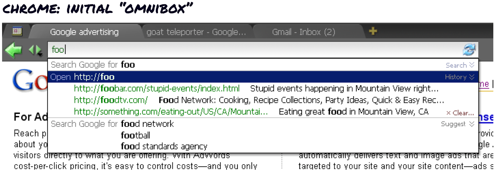
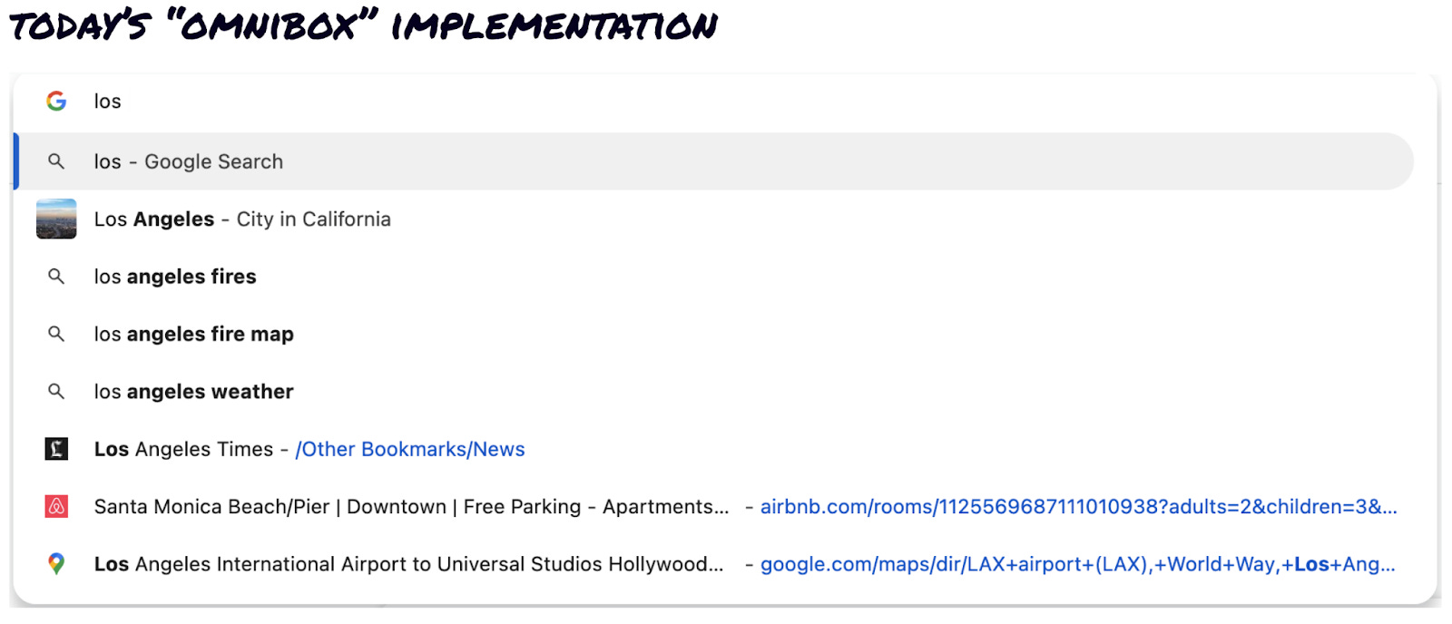
To make the UI as minimal as possible, the team scrapped all of the standard browser components (URL bar, search field, buttons for home, forward, back, and reload, etc.). Instead, they questioned: What were the minimal elements necessary for them to navigate the web and interact with web applications? The team stripped things back so far that the first Chrome UIs only had a URL box and a back button. Over time, additional features were added, but they had to meet the team’s high bar for being essential. OmniboxBefore Chrome, all browsers had two separate input boxes: one to navigate the web (via URLs) and one to search the web (via keywords). The URL box was primary and search was a smaller, secondary input box, like this example from Firefox. In their quest for simplicity, the Chrome team wanted one “magic box” that handled navigating and searching. They wanted to streamline the flow from having an idea to seeing relevant content on the screen. Displaying two input boxes required people to make a decision about whether they want to navigate to a webpage or search the web. Merging these two concepts and UI components into one “omnibox” removed an unnecessary decision point and made it faster and simpler to get to content. Initially, the omnibox displayed both use cases and relied on simple heuristics to determine whether people were navigating vs searching. But eventually, Chrome’s omnibox became able to infer what someone wanted based on what they were typing, what web pages they had visited before, and what other people did when typing the same thing. The design and iterations of the omnibox leading to today’s UI are a whole story in and of themselves, so stay tuned for more on this at a later point! 3. StabilityAt the time, browsers crashed frequently, so the team prioritized reliability and explored many different ways to create a more stable browser. TabsFrom the beginning, the team centered Chrome’s UI around the concept of tabs. Browser tabs already existed and were useful, but felt like they had been wedged into existing browsers.
The Chrome team was committed to building a tab-first browser and wasn’t afraid of breaking conventions. But that didn’t mean UX decisions were easy. Horizontal tabs ate up precious vertical space and forced questions like: What should the relationship be between the URL box and tabs? Which should sit above the other? Where should the toolbar live? Should tabs be stacked horizontally or vertically?
In hindsight, many of these decisions seem obvious. But at the time, they took effort to resolve. Luckily this was a decision that the team resolved by designing, building, using, and then iterating until it felt right to them. The team was so focused on tabs, that they built tabs that could be pulled out from the browser window before they even built a lot of basic browsing features. In other browsers, if a webpage was slow or unresponsive, it would crash the entire browser. But Chrome was built to house separate tabs that all ran independently. So if any individual tab crashed, it didn’t affect the entire browser's stability. Auto-updatingUpdating browsers was annoying and arduous for everyone. For developers, it was frustrating to build for the latest version when many people were still using older versions. So the Chrome team solved this problem for themselves as developers and for themselves as consumers. They built auto-updating into Chrome, so users didn’t have to manually update their browsers. This also made it extraordinarily easy for the Chrome team to “dogfood,” or use the latest Chrome release themselves. Building for yourselfThis is an oversimplification, but there are essentially three main ways to build a product:
Designing a product for yourself (with the intention of building a large scale product) can be risky. Your needs may only be relevant to a small audience, you might over-index on your personal work flows, or you might miss whole swaths of people or alienate others. But this approach worked incredibly well for the Chrome team because they were able to build for their technological needs while keeping their consumer-selves top of mind. They had a few key principles that kept them aligned on their vision. They designed and implemented UI details loosely, anticipating iteration. Engineers were proposing design solutions. Glen was writing code. Everyone was exploring, moving things forward, and raising the bar for everyone else. They were aligned on what they wanted to build and intimately knew the audience they were building for: themselves. |
Similar newsletters
There are other similar shared emails that you might be interested in:
